Size Matters
How big should text be on a website?


It doesn’t matter what you’re trying to say on your website, if nobody can read it you’re wasting your time.
This is so obvious and so fundamental and somehow almost always overlooked. I see tiny text everywhere.
So, let’s address the big question: how big is big enough?
Body text
Desktop: Keep it 16–18px—big enough for most people.
Mobile: Go a bit larger, 18–20px, because if people are reading your site on their phones, you want them scrolling, not squinting.
Think of headings like a restaurant menu
H1 (The Main Course): 32–40px. This is what your visitors came for—bold, clear, and unmissable. The H1 should lead users to the main content they’re after.
H2 (Appetisers & Sides): 24–32px. These are important, but not the focal point.
H3 (Desserts): 20–24px. A sweet addition to the meal, but usually not the reason they went there.
Line Height

Text needs space to breathe. Set your line height to about 1.5–1.8 times the font size. Anything tighter, and reading it feels like ironing a stripy shirt.
Contrast and Accessibility
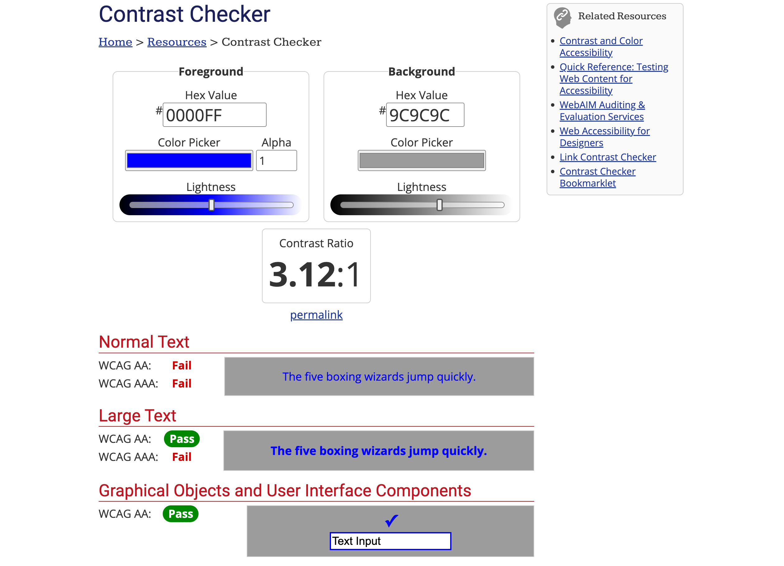
Do us all a favour and make sure there’s enough contrast between your text and its background. Black on white? Great. Grey on slightly lighter grey? Awful.
Follow the WCAG guidelines (Web Content Accessibility Guidelines).
For normal text, you need a contrast ratio of 4.5:1.
For larger text (18px+ or bold 14px+), you can get away with 3:1.
If this feels too technical, just remember: if you’re not sure whether the text is legible, it isn’t.
Additional Considerations
Scannability: Most people won’t read your website—they’ll skim it. Make it easy for them by using larger text for the important stuff. If you bury your key points in a sea of tiny text, don’t be surprised when people click away faster than they arrived.
Audience: If your target audience includes anyone over the age of 30, wear glasses, or frequently squint at their phones (i.e. most people), readable text isn’t a luxury—it’s a necessity.
Responsiveness: Use relative units like
emorremso your text scales nicely across devices. If your website looks perfect on your laptop but becomes a disaster on a phone, you’ve failed.
Bigger really is better. As much as designers love to agonise over kerning, colours, and typefaces, the simple truth is this: if people can’t read it, they won’t care. So do yourself—and your readers—a favour: make it legible.
Slán,
Danny
P.S I released a video on design principles from my course that you can watch here